
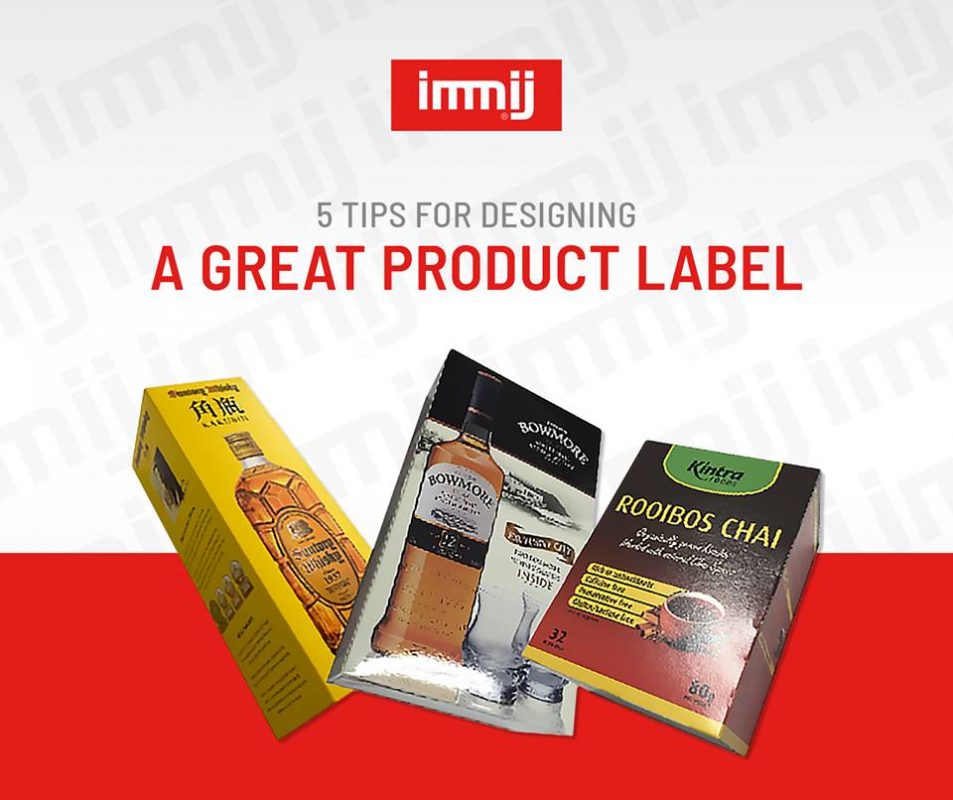
As the marketplace for almost every industry becomes increasingly crowded, it’s growing ever-more important for today’s companies to make sure that they’re standing out in their chosen environment. One of the best ways to capture the attention of your target audience, and showcase your value within a matter of minutes, is to design a great piece of product packaging or a product label for the item you want to sell.
Your label not only informs your customers of what they’re buying, and what kind of problems your product can solve, but it also gives you a unique opportunity to connect with new prospects when they’re browsing a store or looking for items online. So, how do you design a label that really works?
1. Focus on Readability
A lot of companies assume that the most important element of any product label is its aesthetic appeal. While your label should look great, the most crucial thing you’ll need to do is make sure that your customers can read the information you’re trying to show them. Make sure that you choose a large font size that’s easy to see from a distance and pick a font colour that works well with the background of your packaging.
2. Think about Fonts
Font is another important factor to think about when designing your product labels. You want something that’s clear, concise and easy to read, but also unique enough that it captures the attention of your target audience. If you’re going to be using more than one font, make sure that you don’t go over the top with your choices. Too many styles in one place will confuse your customers and distract them from the value of your product.
3. Use Plenty of White Space
White space might seem a little boring at first glance, but it’s important aspect of adding clarity to your labels. The term “white space” doesn’t have to mean including a lot of white in your label, it just means ensuring that there are plenty of open patches between parts of the design, so that your images don’t overwhelm your customers. White space can also be used to create a distinction between different pieces of information.
4. Illustrate
Although it’s important not to make your labels too cluttered, that doesn’t mean that you should ignore the option for illustrations and images entirely. Certain labels will benefit greatly from the use of pictures, like plant labels where a customer might want to see what kind of plant they’re going to be growing. Just make sure that you keep the images you’re going to use in mind when choosing colours, fonts, and content.
5. Be Creative
Finally, remember that the whole point of designing a great label is that it gives you an opportunity to stand out from your competitors on the retail shelves. With that in mind, make sure that you don’t just copy and paste what someone else has done. Instead, find a way to convey your unique personality as a brand through your choice of pictures, design, and style.
Give us a call today on 1300 794 139.