
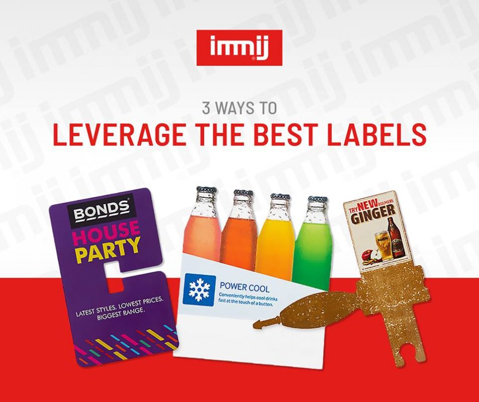
Whether you’re designing labels for a commercial product that’s about to go on a retail shelf, or you need labels for your new plants at a local greenhouse, it’s crucial to get the details right if you want to avoid having to revise and reprint your entire selection of promotional materials.
While every company will have a different idea of what the right labelling should look like, there are a few rules to follow when you’re making your design choices that can help to ensure that you make a decision that’s right for both your brand and your customers.
Here, we’ll look at just three important things you can think about when you want to make sure that your labels capture the hearts and minds of your audience.
1. Use Texture, Colour and Type Carefully
Many experts believe that it’s best to design labels in CMYK instead of RBG, but it depends on your personal preferences which solution you’ll choose. Regardless of the method you prefer, it’s important to think about colour in terms of how it will show up on your label. Make sure that you combine the right shades with typefaces that will stand out from the rest of the hues on the packages, and that it’s easy for your customer to read the information you provide.
While a reflective or metallic font might seem eye-catching at first, the truth is that it can also make things harder to read. Remember to think about the psychological effects of the designs you choose too. For instance, a rustic label could look fantastic for a botanical brand, but it wouldn’t work as well for a high-tech company. Make sure the shades and textures you choose properly represent your business.
2. Keep the Product in Mind
Labels should never be designed in a vacuum. In other words, you should always have a good idea of the kind of product you’ll be labelling. Yes, it’s important for your label to fit your chosen container, but you’ll also need to make sure you think about additional factors too, such as what shape your container is, whether any edges are going to affect the images you’re using, or whether texture could damage the final design.
It’s also worth thinking about how much of the actual product you want to show around the label, or through the label, if you choose a transparent option. There are plenty of designs available to choose from, so don’t restrict yourself to labels that don’t suit your needs.
3. Be Memorable and Distinctive
Finally, your labels and packaging, just like your brand, needs to stand out if you want to make sure that you capture the attention of your target audience. Think about how other companies in your niche present your products and ask yourself which trends you want to adhere to, and which you want to ignore to give your labels a more distinct look. While there’s nothing wrong with observing your competitors when you need help finding inspiration, you should always make sure that the finished product is clear, distinctive, and personal to you.
Give us a call today on 1300 794 139.